Picture this: You’re an IT leader working with a software development firm to create custom software that will optimize several of the processes in your business or for your customers. You roll out the software, and … the product is poorly received. Why? Because for all its vivid colors and trendy designs, the software lacks user-centered functionality.
The questions to ask are, what are the warning signs of a project that is all flash and no substance, and what are the essential features of highly functional, user-centric software design?
Warning Signs
There are many warning signs of a software development project that clearly prioritizes visual design over functionality.
One of the biggest signs, and an incredible way to gut-check a design, is employee sarcasm on your internal communications channels (like Slack or Teams). As soon as new software is rolled out internally, IT leaders at a company can measure its success by gauging how employees react to it internally. While they may not feel comfortable sharing their disapproval directly with IT decision-makers, they certainly won’t hold back in their more casual channels with co-workers. Sarcasm, criticism, and negativity are incredible indicators of the effectiveness (or lack thereof) of a company’s new software product. On the other hand, silence on Slack should be considered a resounding success, and a sign that your software is actually useful and functional, not just pretty. When it comes to UI, no news is good news.
Another warning sign of a beautiful, yet dysfunctional app is when the design is extremely “trendy”. This isn’t to say that on-trend designs are categorically bad, but that trends are fleeting and temporary by nature -- and a good, functional design should be built to last. There is innovation and popular styles in user interfaces every year, but they always fade into obscurity eventually. Nothing lasts longer than good UI, allowing users of the software to feel like it is an intuitive product, designed to make their lives easier or better.
Instead of designing around today’s hot trend, UI designers need to think bigger-picture and prioritize the features that have historically proven to be successful. This means focusing on simplicity, speed, and ease-of-use. People who use the software will be grateful. Designers should aim for a simple color palette, easily legible typefaces, foolproof navigation, and clearly demarcated headers.
Essential Features of Functional UI
But how do you strike the balance between a design that looks good, and puts the U in UI? Depending on software needs, there are many ways to answer this question. It could be minimizing the number of clicks, simplifying the layout, formatting different features thoughtfully, or designing with an accessible and inclusive mindset. The most important thing is to get regular, definitive feedback from your prospective users about what they need to do in the system and what they like about other, similar software. Let the user tell you what they want out of the system and match that with the business goals of the application. The goal is to develop software that solves problems and improves processes. If your software is creating new issues, it’s time to reassess and go back to the drawing board.
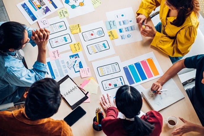
However, the singular way to ensure software utilizes functional design is to validate the desired workflows diligently and repeatedly with the intended user base by each role. This should occur consistently throughout every stage of the development process. During the preliminary stages of development, send surveys and focus groups to future users to gauge their priorities, needs, and opinions. These are the people who will be using the software daily, and it’s important to ensure the preliminary design plans align with their vision and needs.
Next, as each phase of the design process is completed, continue to test and gut-check the design with the people who will be using it. Ask questions like: Is this easy to use? Does this feature make sense? Does this speed-up processes? Is there anything that is unnecessary in this process? What feature is missing? Not only will continuous testing save hours of time in the design process, but it also helps the designer to take a step back from the process and see things more holistically.
Remember, humility is at the core of UI. Design teams should solicit critical feedback throughout the process and should be comfortable making constant tweaks to their design. It will save IT leaders and CIOs a tremendous amount of money in the long term and will ensure the software is launched correctly the first time.
Takeaway
IT leaders and UI designers should always remember that good design is nothing without good user workflows. Brands that focus on creating intuitive, practical software will notice superior results over those that prioritize pure aesthetics.
